This is the time of the year where many of us start planning for more time spent inside, as the fall months start to take hold.
Interior designers can help homeowners create a sanctuary and create a place of calm and serenity as cold winds blow what’s left of the coloured leaves off the trees.
Many people are reinventing their space, “quieting” it, says Calgary-based designer Amanda Hamilton, a participant in this year’s Interior Design Show.
What colours to go with to create tranquility
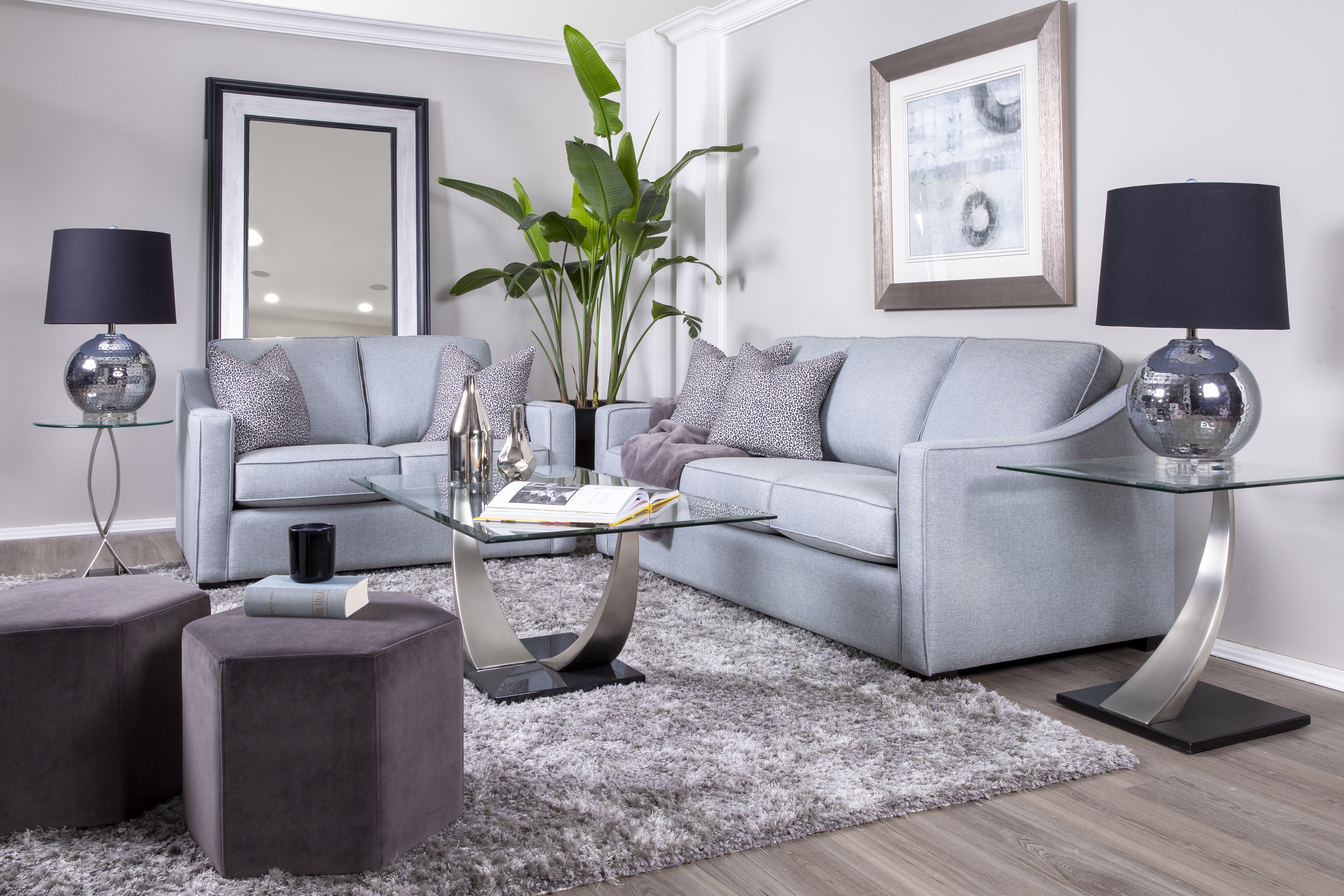
A monochromatic combination of colours, by using different tones of the same colour, rather than bold or highly contrasted hues, will evoke a sense of calm, Hamilton says.
“If you do want to use colour, stay away from reds, oranges, and yellows, which can increase the heart rate,” she says.
Instead, opt for greens and blues, which are traditionally more calming as they occur in nature. Greens are especially popular these days as they convey harmony, freshness, health, and restoration, says Dawn Chapnick of Dawn Chapnick Designs, a full-service design firm. Deeper blues suggest reliability, safety, and strength.
Chapnick says these colours are also ideal for creating a sanctuary feel: greys evoke harmony; browns suggest stability; pinks are gentle and soft; and purples are meditative and sensual.
“The world of colour is infinite,” she says. “Colour can create context. Where colour is placed impacts how it is interpreted by our brains.”
The psychology of colour
The psychology of colour is an important factor in home décor, says Jude Kamal, a Toronto interior designer, founder of Sansa Interiors.
“They can spark up certain feelings and emotions,” she says. “Different rooms or areas have different functions and potentially would need colours, textures and specific design details to make them truly stand out.”
Design isn’t just one element in a room. It’s about a variety of elements coming together to form a function or a story behind a space, Kamal adds.
When choosing colours for a room, designers first factor in the walls, ceilings, floors, and windows. Is the space sunny or darker? Is it cold or hot? All of these factors affect colour choices.
“So if the room, on one hand, doesn’t get any sunlight and you need it to feel more homey, then picking neutral light tones, like an ivory or a muted yellow, would help warm it up,” she says.
To elevate the colour used in a dark space, she suggests using reflective finishes like mirrors on the walls, glass or stone accents paired with lots of layered lighting so the colour chosen is seen in the best light.
Kamal likes using light blues, greys, and greens in the bedrooms and bathrooms because they create a soothing, spa-like feel that is mellow and muted.
“Think of the sky,” she says. “When you look at the sky for a few minutes you feel relaxed and at ease.”
Earthy and light tones work well in kitchens, living rooms, and general areas, she adds, with touches of dark or shiny metal here and there. That combination of “harsh” metals and earthy wood and neutral tones presents a nice contrast that is grounding.

“If you love colour, you can incorporate colour in your living spaces via accent chairs, art, decor pieces, and wall accents,” she says.
What textures make us feel warm and snug?
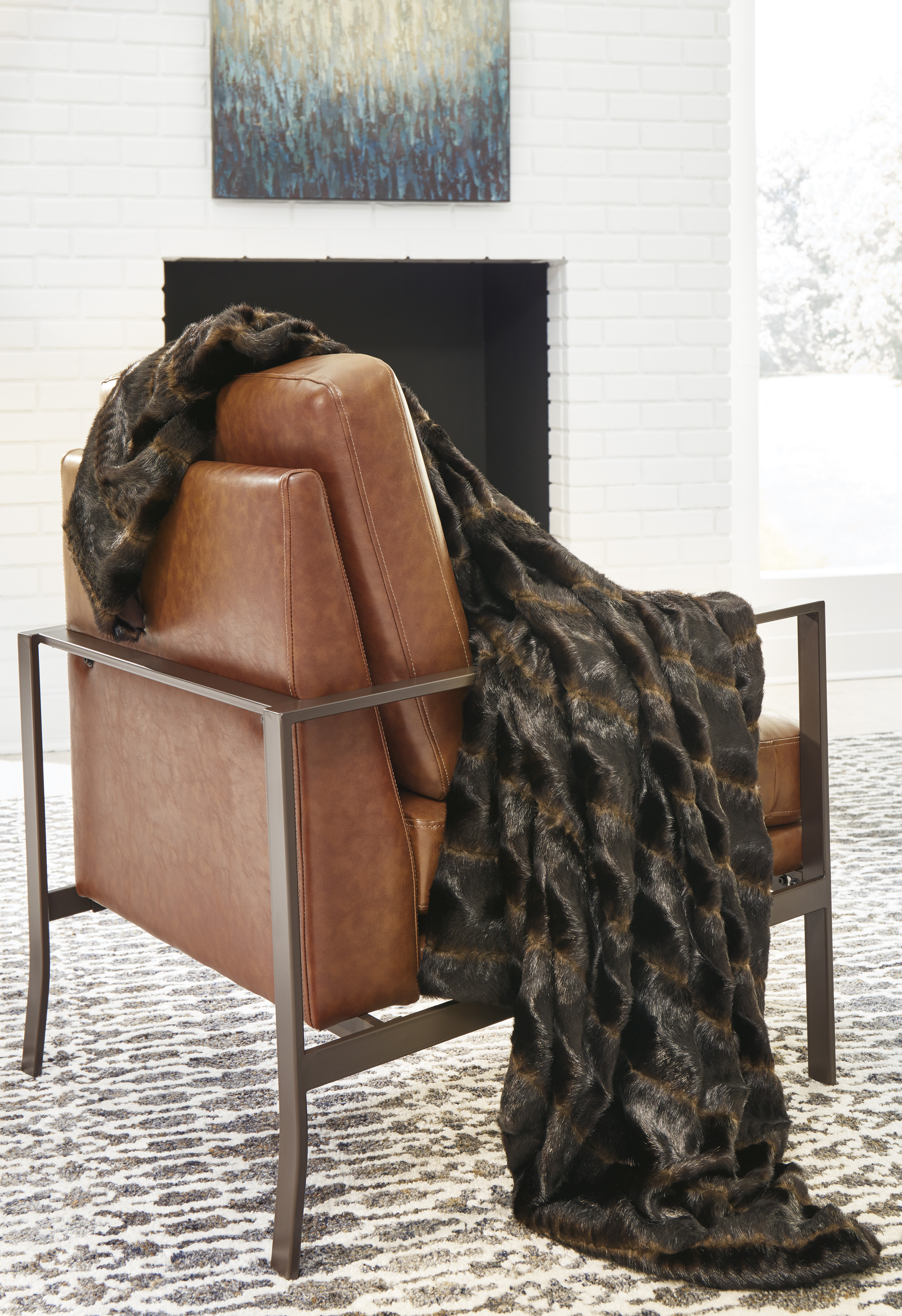
Chapnick says texture, as it relates to interior design, is the way something physically feels and how it visually appears to look. Lighting can affect how texture is seen as well.
“Texture makes the difference between a room feeling warm and inviting compared to cold and sparse,” she says.
Texture refers to surface quality, such as whether a material is soft, metal-like, smooth, lumpy, rough, or flat, and can be applied to carpets, wallpaper, pillows, and furniture.
“And knowing how to play with scale and colour of each design piece will be part of what contributes to the coziness of a space,” she says.

Opt for carefully layered off-whites, ivory, oatmeal, and flax tones in different fabrics such as velvet, linen, and boucle. The idea is to create visual interests that are soft on the hand.
One tip, which will also help with clutter and creating a more serene space, is to use textured storage items in interior design.
“Using baskets that complement the style can add texture and keep the space organized,” says Chapnick. Woven baskets, felt baskets, even rubber or marble catchalls, will work.
Kamal says to be careful with leather, as it’s a colder material that can feel more formal. Balance it out with other soft and upholstered accents.
“Boucle is soft on the face for those mid-afternoon naps or Netflix binging,” Hamilton says.
Velvet and boucle are popular options for furniture and throw pillows now. And for bedding, washed linens or cottons can make you feel like you’re at a luxury hotel.
“All elements of design (line, shape, colour, texture, pattern, proportion, and light) are necessary in varying degrees to create a tranquil and soothing space,” Chapnick says.
Looking to create more comfort at home? View our various collections for natural and easy ways to tap into this trend.